


I beat the robots! Colour checker tools: 0, Me: 1 (SBLTN Lab Notes 044)
The flaws of colour checkers, political banners of Mumbai, and documenting Plains Indian Sign Language

IN THE MARGINS
Here’s to my Day Ones! 🎉
It’s official! Over 100 of y’all come to hear/read me ramble about digital accessibility, chat about DEI challenges and change, show weird art and rant about graphic design trends. THANK YOU! I initially thought starting this newsletter was dumb (shouting into the void) and egocentric (what makes what I have to say so special?). And although I fell off for a minute, I’m so appreciative for the people that stuck around… now you’re stuck with me 👿
ACCESSIBILITY
Accessible design in action: Colourful yet flawed
“Don’t talk about it, be about it”.
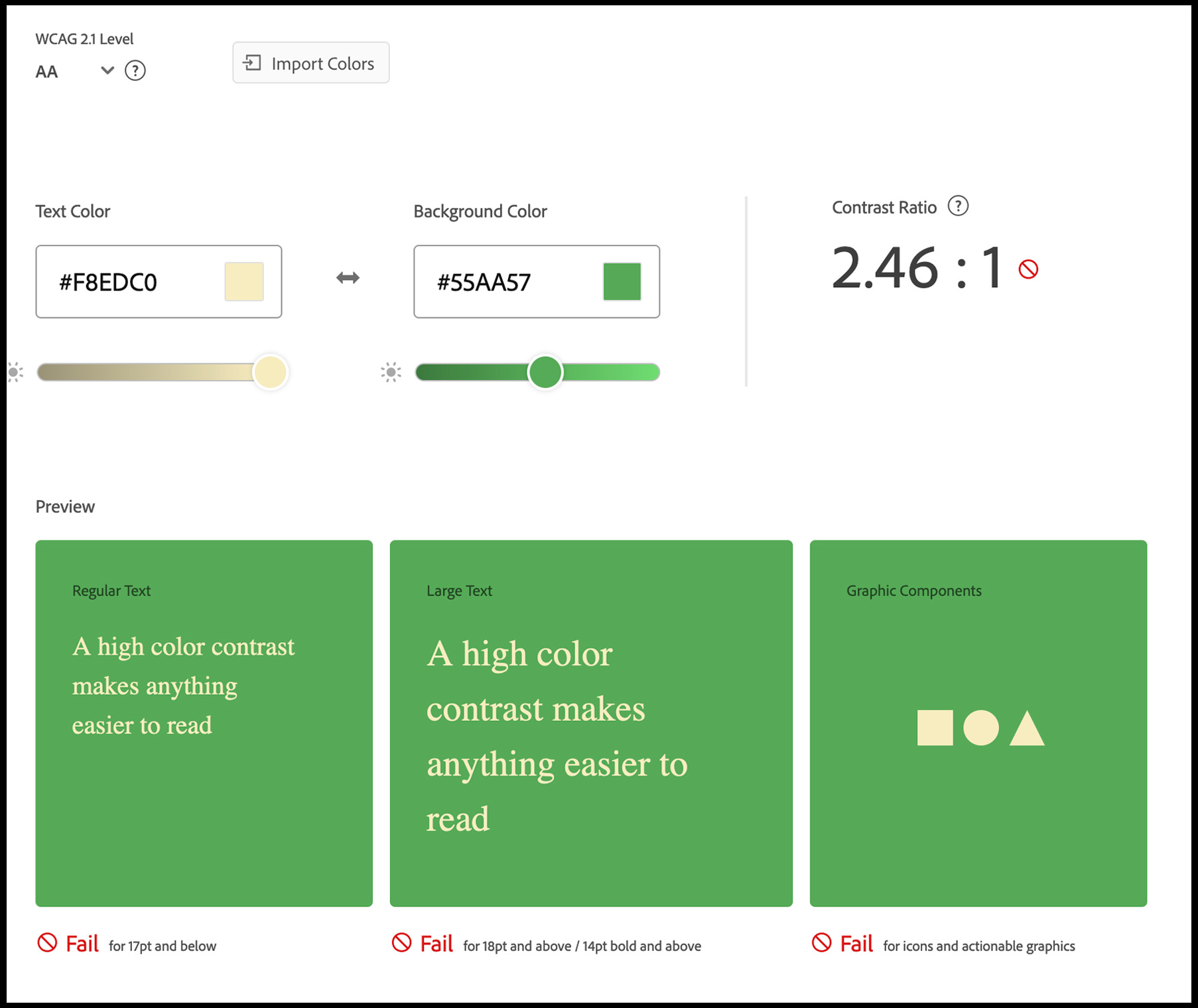
Well, as much as I learn and try to absorb about digital accessibility, I also have to put it into action. Case in point: a colour palette for a client that hit a snag: green background and cream text (for the designers, #55AA57 and #F8EDC0, respectively).

Let’s dive into a little client colour palette chaos…
When running this combo through a colour accessibility checker, it TECHNICALLY failed but VISUALLY still worked. It failed because the recommended contrast ratio for large text should be at least 3-to-1 and for regular text at least 4.5-to-1. The combo had scored 2.46-to-1, according to the tool - less than the suggested 3 or 4.5.
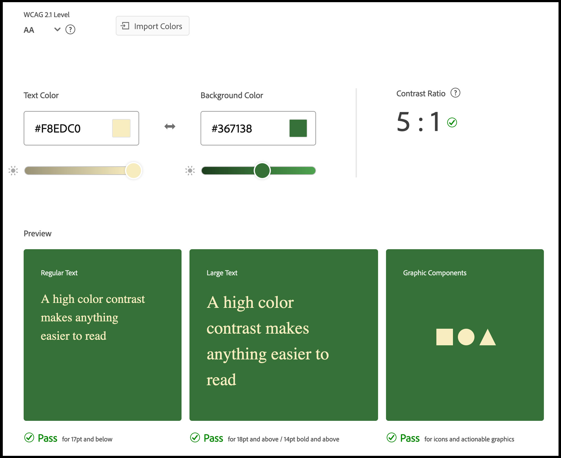
Now the “easy” fix would’ve been to tweak the green a bit so that the combo passes with flying colours 🤭. By simply using a darker green, the contrast ratio shot up to 5-to-1.
But I started to wonder if (1) the tool was accurate and (2) were there any circumstances that the original combination would pass?
Well, this is where the flaw of these tools comes into play.
As advanced as these colour checker tools can be, there’s still room for improvement because they can’t exactly mimic the human experience of sight. The guidelines are math-based but our eyes are more complex than formulas. Human eyesight isn’t easily reduced to number crunching.
The result?
The tools using the colour guidelines will sometimes give a “fail” rating to a combination of colours that actually visually work or give a “pass” rating to a combination of colours that doesn't work.

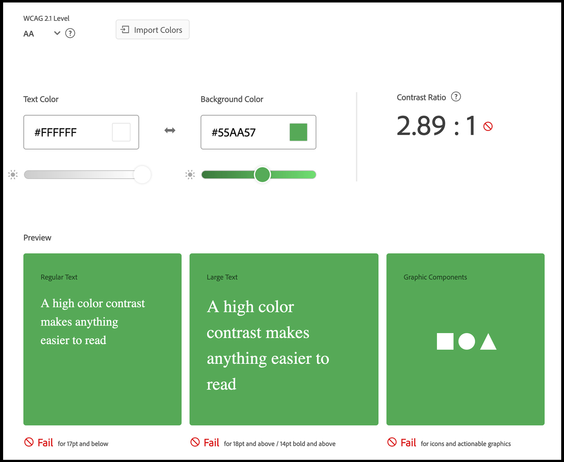
In the above example, on the left are certain combinations that have a passing rating such as blue text on green background. For those that are sighted, just looking at them can make you wonder how the hell does that pass since they are barely legible without squinting or straining your eyes. However, on the right are combinations that can be read much more easily (such as white text on green background) and yet gets a failing score.
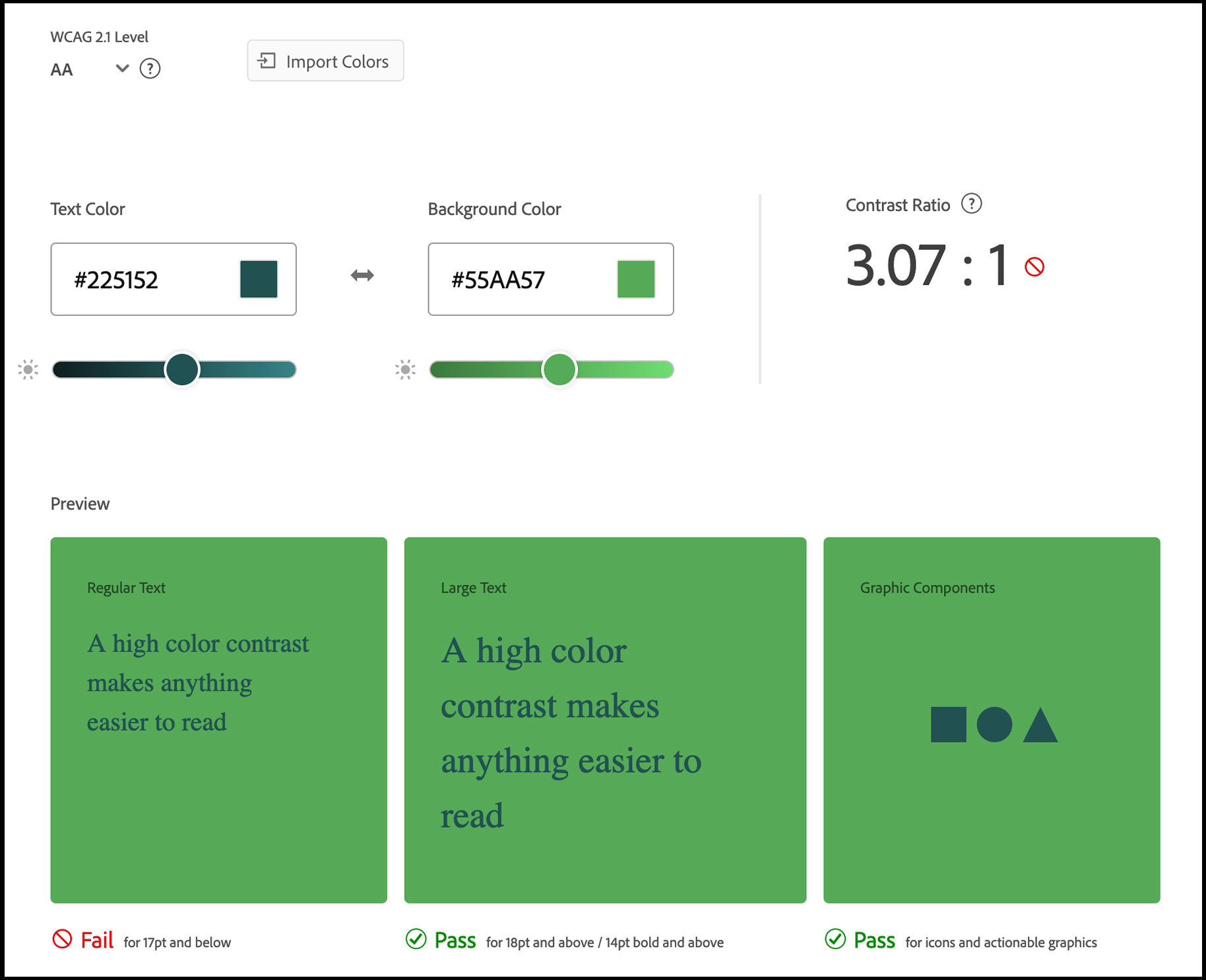
You can see the flaw with the tool using the original green and cream combo. White text on green also failed, yet (strangely) dark green text on green PASSED 2 of the 3 areas.
So I went back to the drawing board with my green and cream combo - this time using a tool that takes into account lightness contrast.

The tool, APCA (Advanced Perceptual Contrast Algorithm), more accurately reflects how the colour combination would be perceived and what do ya know? The green and cream combo passes!
APCA would’ve let me know if the combination should only be used at large font sizes, for non-text only (e.g. decorative filled objects), not used at all, etc.
Lessons learned:
Sometimes you have to break the rules
Manual testing with a human is always a strong next step when implementing accessible practices
The robots won’t be taking over anytime soon
The good news is that there are people working hard behind the scenes to improve the contrast ratio rules through new techniques and improved algorithms.
DIVERSITY & INCLUSION
Indian Sign Talk (1893)
An early guide, written by a Christian missionary, on communicating in the language now known as Plains Indian Sign Language. Check out the guide!

36 Days of Sign Language Alphabet
The “#36 Days of Type” challenge is cool and all but what about it being done in Sign Language? The first edition of “36 Days of Sign Language Alphabet” showcased great art from Deaf creators for each letter and number. Looking forward to it next year!

ART & DESIGN

‘Without a poster, you don’t exist!’ – on the curious political banners of Mumbai
The 20-min documentary “Party Poster” follows a group of laundrymen in the suburb of Bandra in Mumbai as they design and hang up a poster to celebrate the Ganeshotsav Hindu festival.
Honestly, I was REALLY into this! Especially 7-minutes in when they showed the editing of the Photoshop file and people overall talking about how their public persona is affected by the banners.
I love stepping outside the Western-and-white design bubble and away from fancy offices - back to the people and the streets. And c’mon, who doesn’t love a little late-night rogue installation?
.
.
.
Signing off from the Starship SBLTN,
Laneen (Pronouns: she/they)
HEARD IN THE HALLWAYS
Everybody's Free To Wear Sunscreen
Looking for some life advice wrapped in poetry and delivered via 90s nostalgia?
 - HBO Max | Flixable")
One of my absolute FAVORITE movies is the Romeo + Juliet remake by Baz Luhrmann. The modern setting with the old school language, dope cinematography, and on-point soundtrack is just chef’s kiss! Just like Baz’s R&J adapted a classic, this video uses a famous essay written in 1997 by Mary Schmich, a columnist with the Chicago Tribune.
🎧 Listening: “Like Crazy" (remixes) by Jimin of BTS
✔️ Random Fact: Throughout the world, people are familiar with animals in police service, particularly dogs and horses. But, there are regions in China that rely on the loud and disruptive nature of geese to help police the streets. Their commotion has deterred many criminals in recent years. (Source: A 2015 article but this tactic seems like it would stand the test of time haha)
👀 Watching: “Scientists Invented a Jail-Breaking Liquid Metal Robot”
THE COLOR CHECKER!! I've always had that thought of why the heck does it prioritize dark text on already dark colors. I need to run some colors through the APCA checker now.
OMG!!!! This is one of the best posts you’ve ever done! This was FASCINATING! I am going to prioritize the one color checker over the other now but also trust in the eye 👁️